If you prefer to print out the whole supervision instruction, please find the pdf version in the section of supervision on RM03 Moodle page.
Supervision 3 (8 March, 2022)
Instructions
- Read through the instruction carefully. You may face problems if you overlook any of the steps.
- The instruction for data collection via APIs is written in Google Colab, a free jupyter environment that requires no setup to use and runs python entirely in the cloud. You need log in with your Google Account to use this free platform. If you do not have Google account previously, you can try to log in with your Cambridge Email address (CRSid@cam.ac.uk). Know more about Google Colab, please check this link.
- If you do not have Twitter account, please apply one via this Twitter Signup
Note: functions and filename are highlighted in this document.
Supervision overview
In this exercise, you will familiarise yourself with collecting data via Application programming interface(APIs), spatial visualization with geotagged tweets and creating a proper map on QGIS. The first two exercises will be practiced on Google Colab and the last exercise will be practiced on QGIS.
1. Collect Tweets via API
2. Content Analysis of Tweets
Please click this button below to move to Google Colab to start the first two exercises. Once open the colab, log in with your Google acount and save a copy to your own Google Drive.
3. Visualizaton of Geotagged Tweets
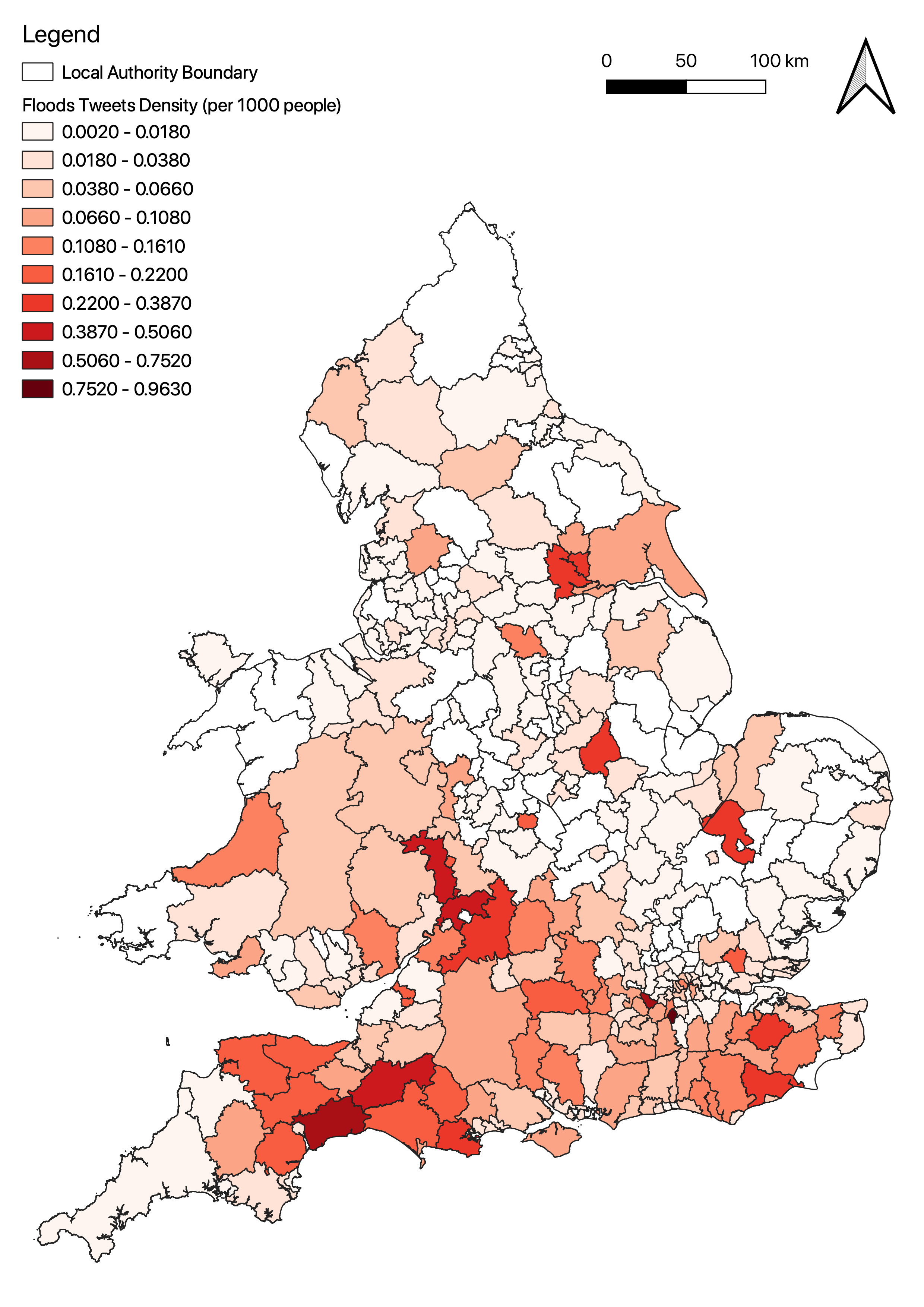
With geotagged location, social media can be used in mobility pattern identification, sentiment detection, emergency management and so on. In emergency management such as natural disaster or epidemic, social media paltform like Twitter can be used as crowdsourcing tool to collect real-time information in different effected areas. In this section, we will use geotagged tweets to identify the effected areas suffering floods or storms in the early spring 2020. In this exercise, we will give you a collected data (data was collected in March 2020) to demonstrate how to process and visualize geotagged tweets.
QGIS Project Setup
Before using QGIS, we need to setup a QGIS project. It is suggested to create a folder and name it as rm03_YourCRSid_sup3, at your prefered directory on your disk. This folder will be the working directory for the assignment and supervision.
- In the menu bar, Click
Project>Newto create a new QGIS project. - Go to
Project>Save Asand save assupervision3.QGZto the working directory. - Go to
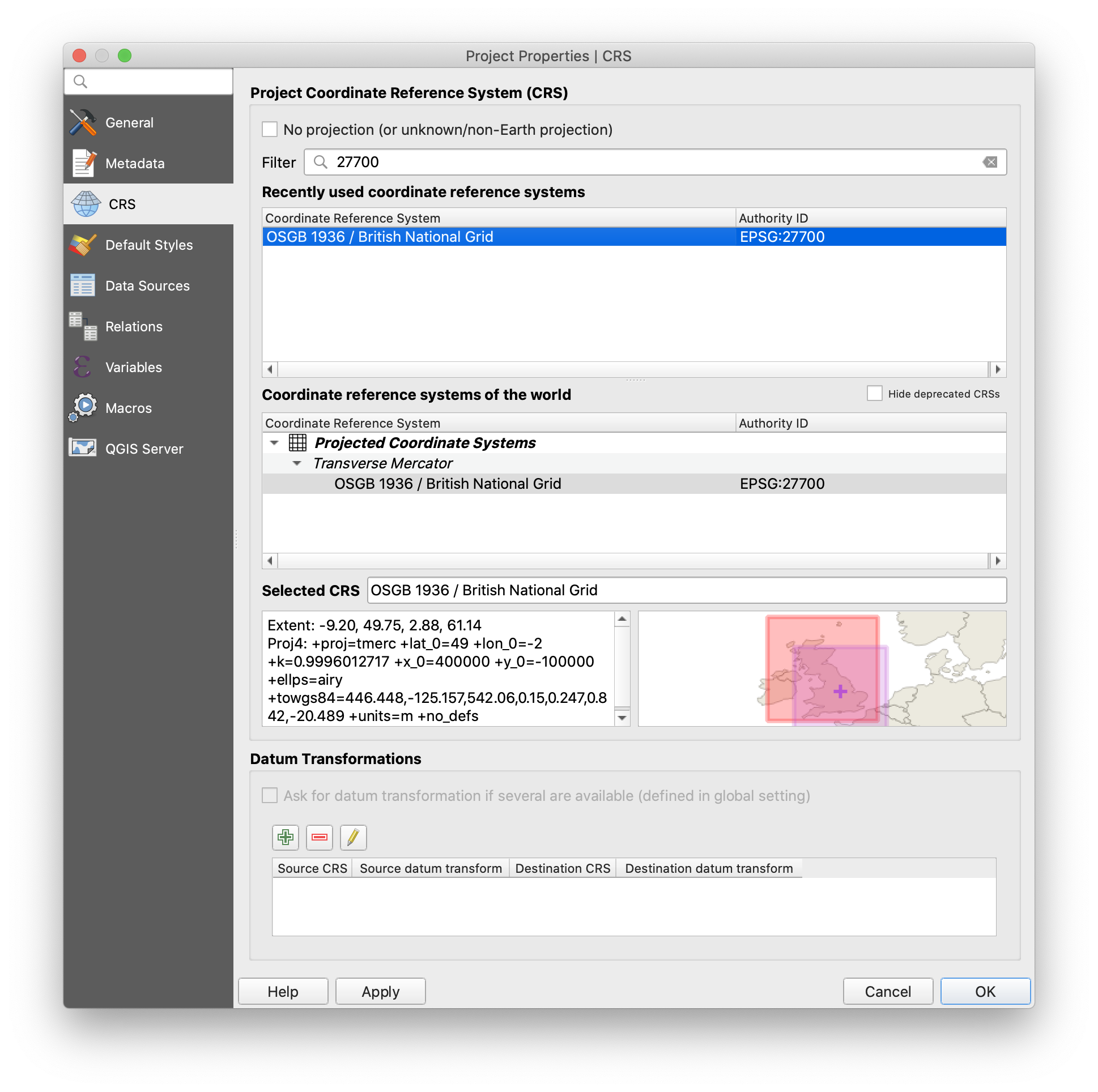
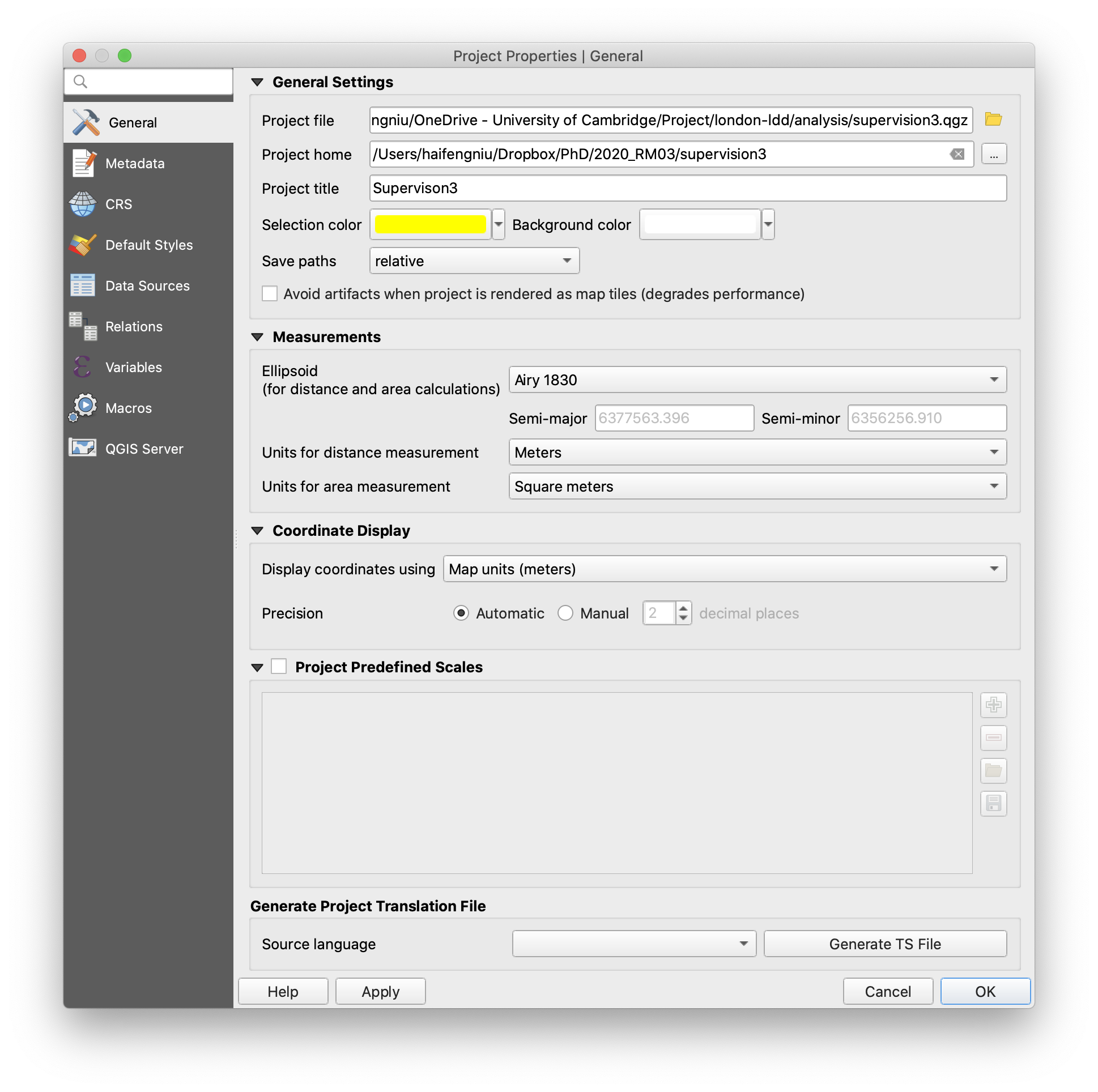
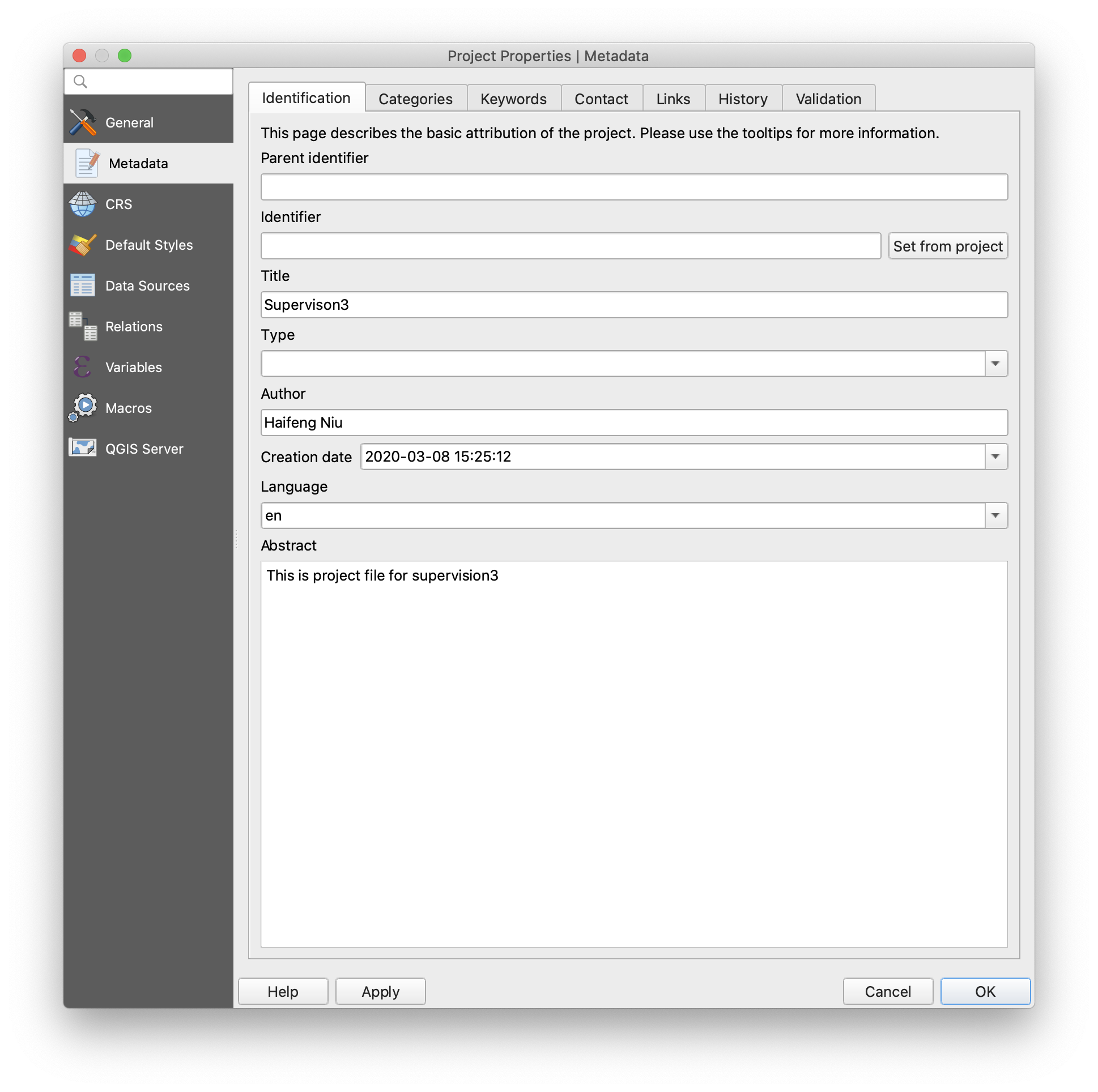
Project>Propertiesand open theProject Propertieswindow. -Generaltab: in the general settings, set your working directory asProject Home, change the unit for distance measurement you prefer and also display coordinates units. -Metadatatab: It is suggested to input title, author, creation date and a short abstract in the identification tab. -CRStab: this tab provides Coordinate Reference System (CRS) setting for the project file. Here, we choose the projected coordinate system,OSGB 1936/British National Grid EPSG:27700. Be aware that CRS setting in theProject Propertiesis just for the project (calledData Frame settingin ArcGIS). CRS setting for layers will be introduced later.
Note: after addingProject home, you can findProject Homedirectory is showing in theBrowser panel. It is much easier to locate your data files through this panel.
Making density map based on their location
In the first exercise of this supervision, we learned how to collect tweets data via API and save the query as CSV file. In the CSV file, geographic coordinates are stored as latitude and longtitude (based on WGS84), which can be plot in QGIS as points. And we want to summarise geotagged tweets for each local authority and find the effected areas. So except for tweets data, we will boundary for local authorities.
- Download
Census_Merged_Local_Authority_Districts_December_2011_in_Great_Britaindata from: link andflood_tweets.csvdata from link (right-click and save as CSV). Both files should be saved into your working directory.
Importing tweets file and local authorities boundaries
-
Import shapefile into your project: Locate
Census_Merged_Local_Authority_Districts_December_2011_in_Great_Britain.shpfile at your working directory in theBrowser Paneland hold the left mouse and drag the shapefile into the map window. Alternatively, you can add vector file through data source manager. Click Open data source manager button on Data source manager toolbar and switch to Vector tab. Choose file as the source type and choose your shapefile in the source path. -
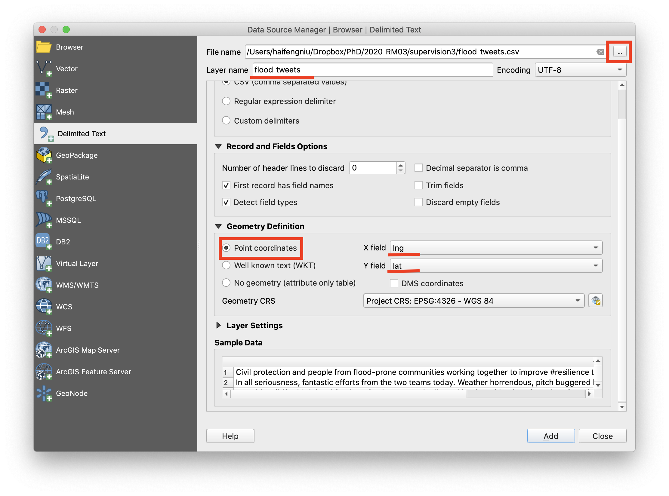
Navigate to menu bar click
Layer>Add Layer>Add Delimited Text Layer. Browse theflood_tweets.csvjust downloaded. In the section of File Format, choose CSV. In the Geometry Definition section, choosePoint coordinatesand selectLongitudeandLatitudefields as X Y fields respectively. Normally the Geometry definition section will be auto-populated if it finds a suitable X and Y coordinate fields. Then choose the right CRS (EPSG:4326 - WGS84) for this file. Finally, click add and you will find a point layer.
Calculate density of geotagged tweets in local authorities (normalised by the population)
After importing the flood_tweets layer, you can see there is obvious cluster around London in the layer. The reason is that there are more twitter users in London because of its large population. It is inappropriate to directly summarise flood-related tweets within local athorities to identify possible affected areas. We need to use normalization to minimize differences in the amount of geotagged tweets, which is caused by population variation among local authorities.
-
Navigate to
Processing>Toolboxand searchJoin attributes by location(summary). In the prompted window, chooseCensus_Merged_Local_Authority_Districts_December_2011_in_Great_BritainCambridgeas input layer andflood_tweetsas join layer. In the geometric predicate section, chooseintersects. In the section ofFields to summarise, choosetextas the field. In the section ofSummarises to calculate, choosecountas summarise function. To do so, you will count the total number of tweets in each local authority.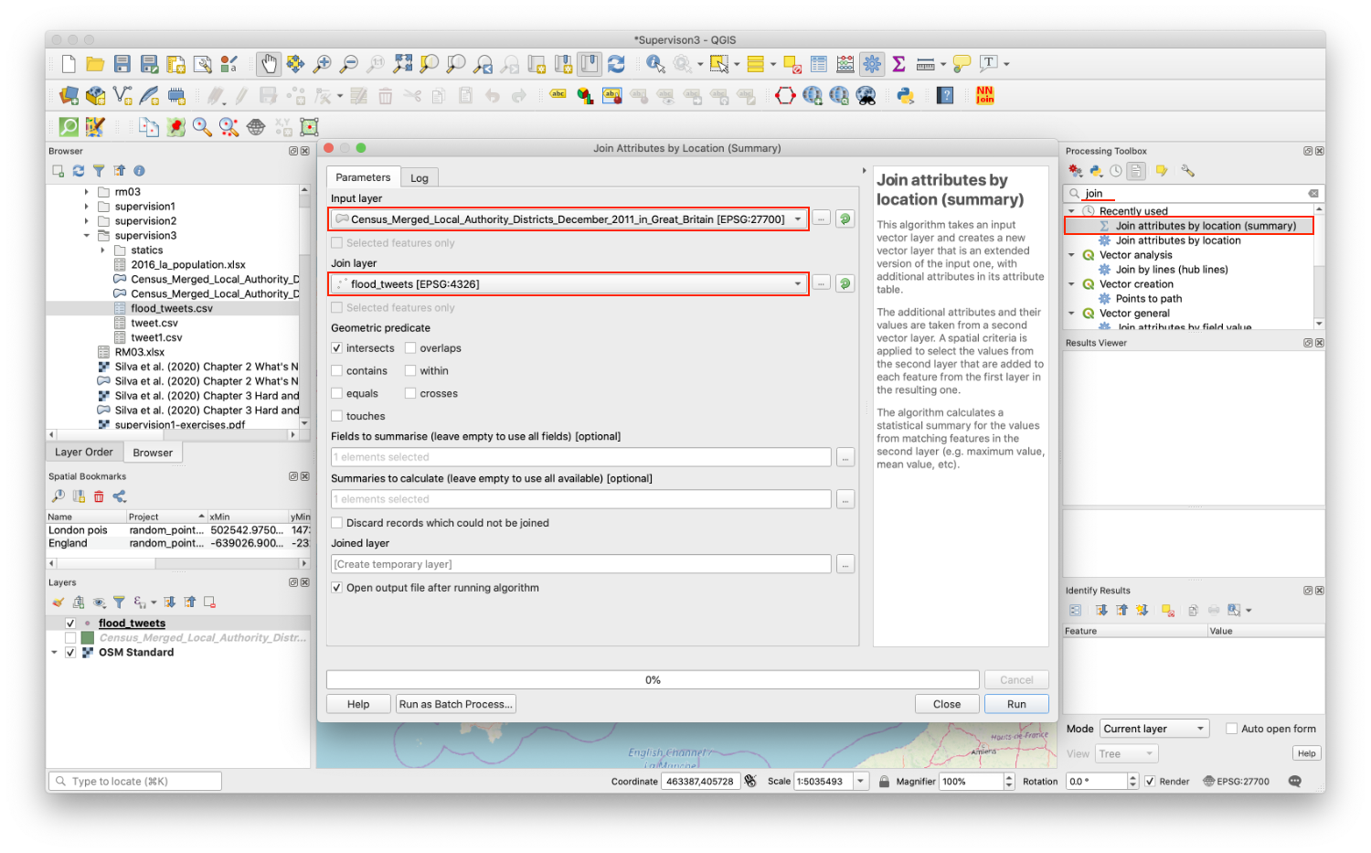
-
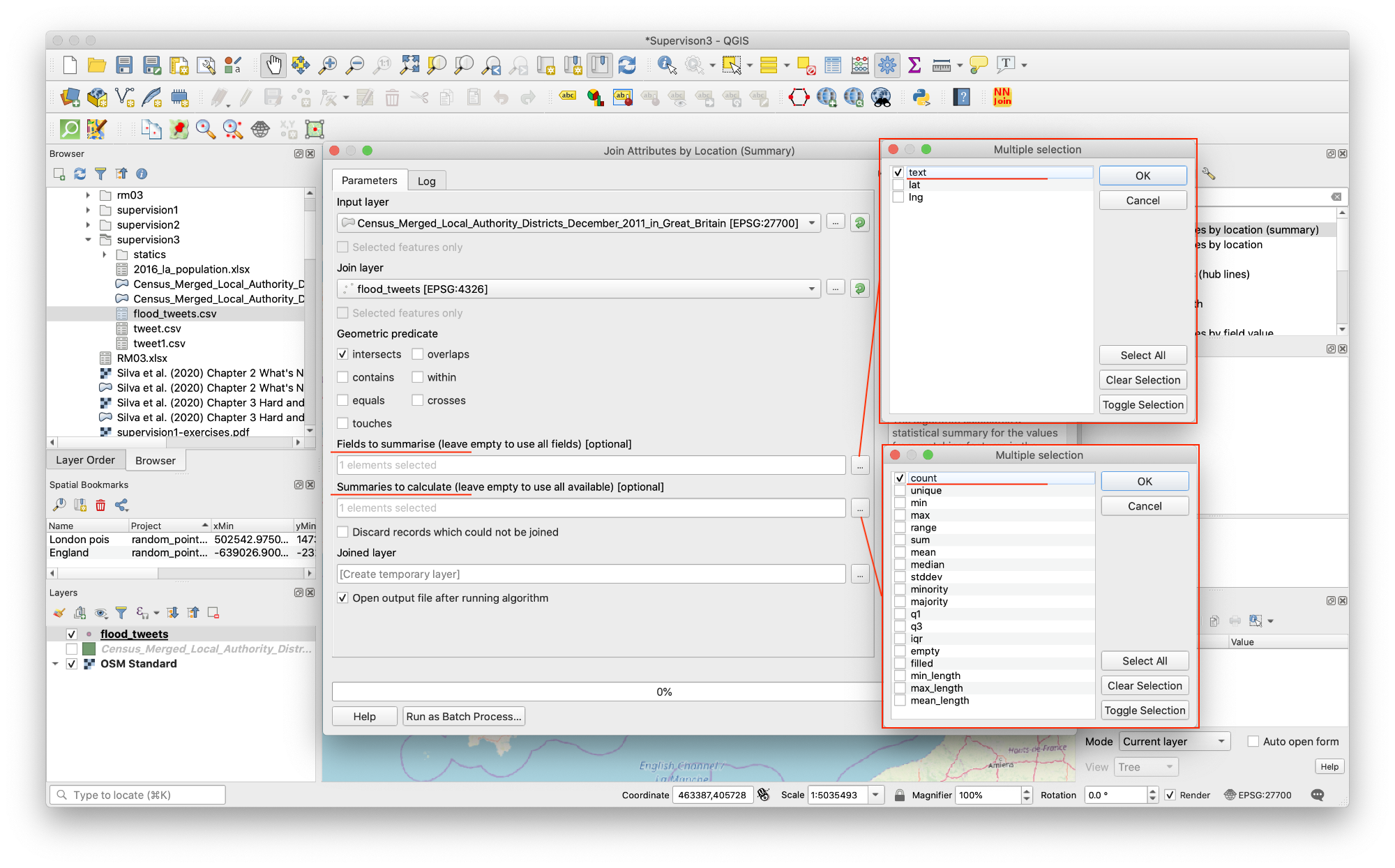
In the Attribute Table of
Joinedlayer, clickOpen field calculator. Create another new field named astweet_normalisedand set the output field type toDecimal number (real), Precision = 10 and Scale = 3. In the expression window, input1000*text_count /Pop_2016and we will compute tweet density, number of flood-related tweets per 1000 people in each local athority.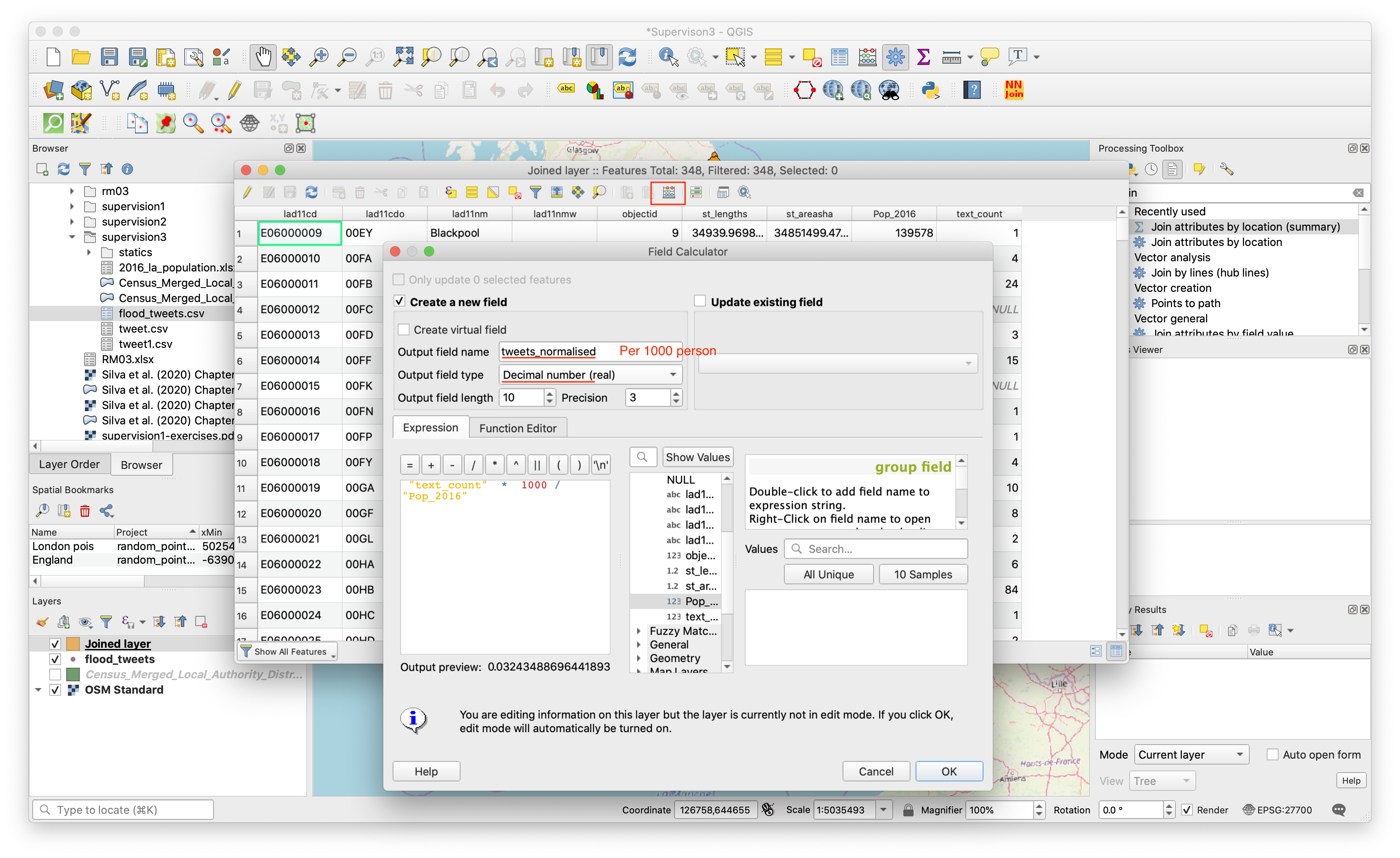
-
Symbolised
Joined layerinGraduated colorbytweet_normalised(per 1000 people) column . After choosing color ramp, setClassesat 10 inNatural Breaks (Jenks)mode (See this link to further understand natural breaks-Jenks). ClickClassifybutton and add all classes.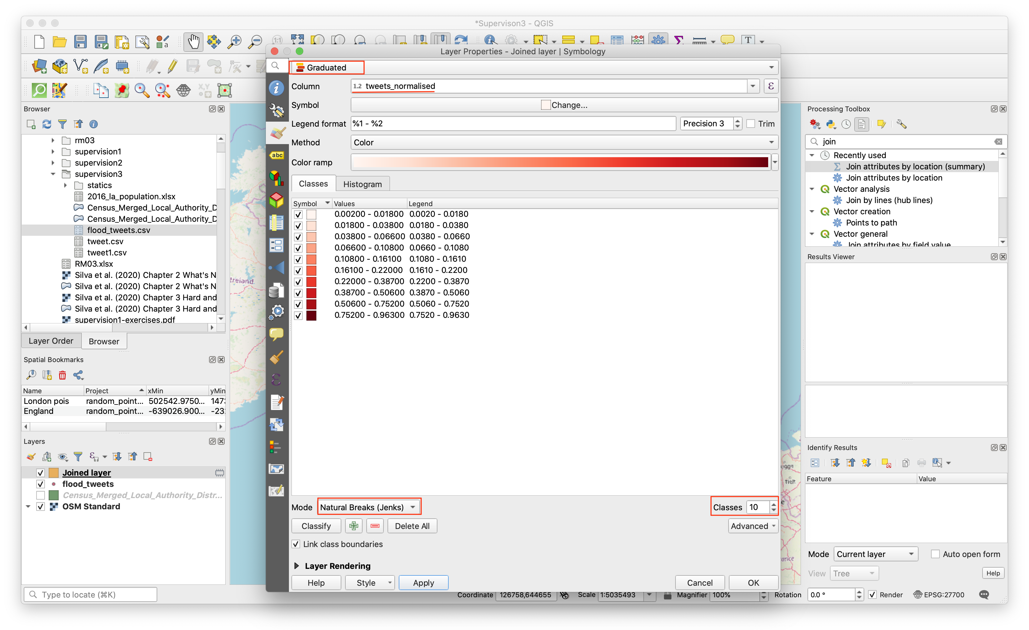
Using QGIS Layout Manager
In this part, you will practice how to use QGIS Layout Manager to add map elements and export map.
The Layout Manager
QGIS allows you to create multiple maps using the same map file. For this reason, it has a tool called the Layout Manager.
- Click on the
Project->Layout Managermenu entry to open this tool. You’ll see a blank Layout manager dialog appear. - Click the
Addbutton and give the new layout the name offlood_tweets. - Click OK.
- Click the Show button.
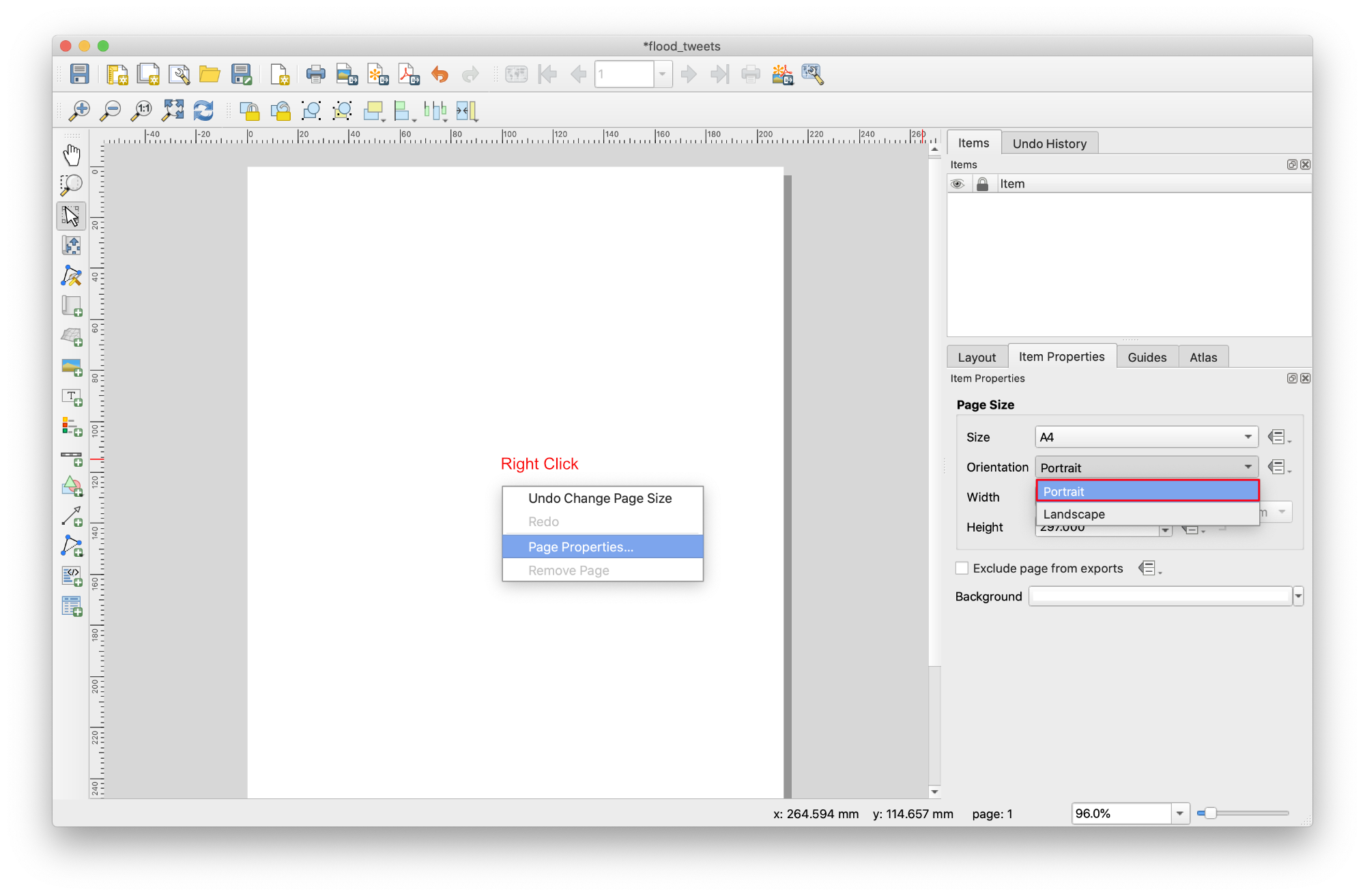
- In blank area of page, right-click and open
Page Properties. - In the
Item Propertiestab, you’ll find thePage Sizepanel. SetOrientationasPortrait.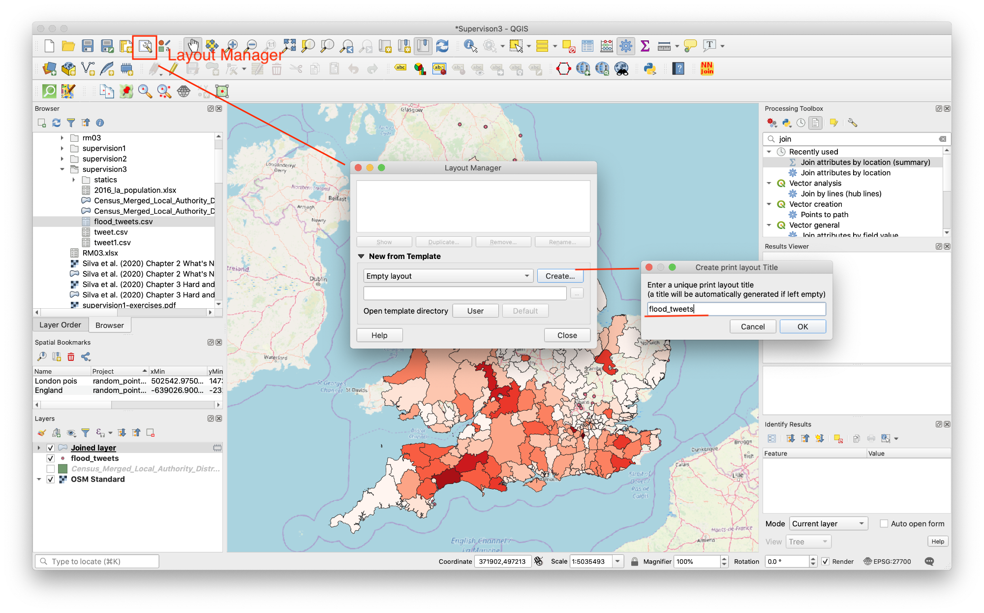
Add Map
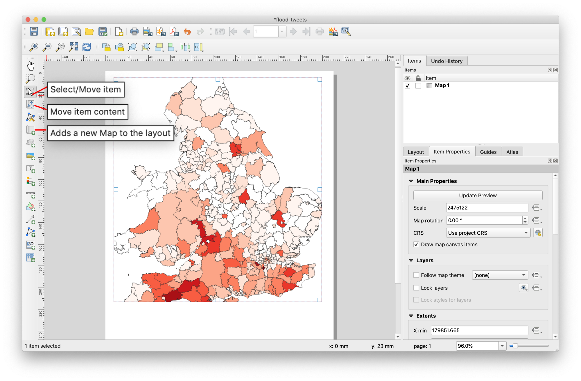
Now you’ve got the page layout the way you wanted it, but this page is still blank.
- To add the map, click on the
Add New Mapbutton. With this tool activated, you’ll be able to place a map on the page. - Click at the upper left corner. Hold mouse and drag a box on the blank page. The map will appear on the page.
- Move the map by clicking and dragging it around.
- Please try other tools to change size of your map or move content in a right right place.
Because a Layout in QGIS is part of the main map file, you’ll need to save your main project. Go to the main QGIS window (the one with the Layers panel and all the other familiar elements you were working with before), and save your project from there as usual.
Adding Map Elements
Now your map is looking good on the page, but your readers/users are not being told what’s going on yet. They need some context, which is what you’ll provide for them by adding map elements. Let’s add elements.
Add Legend
- Click on this button:
Add a new Legend to the layout -
Click on the page to place the legend, and move it to where you want it:
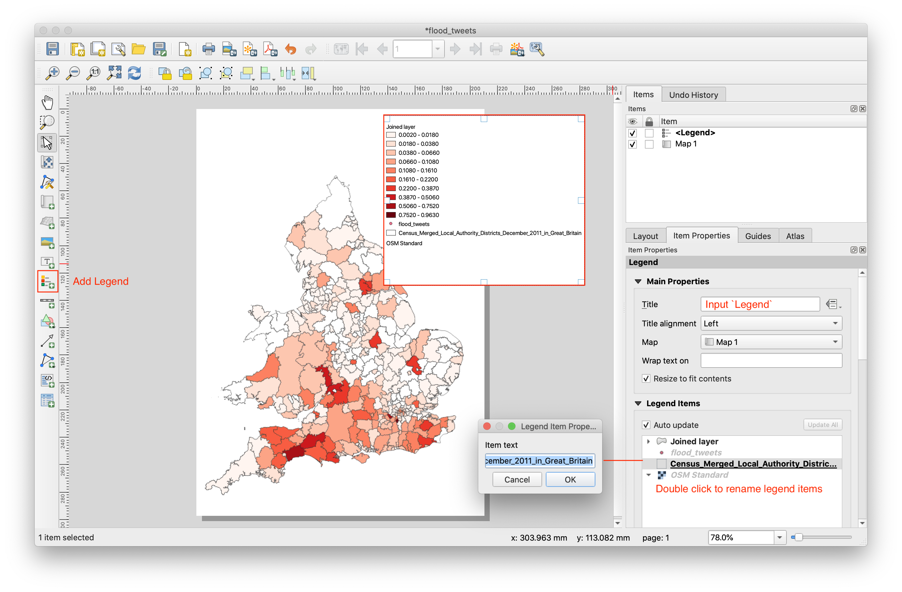
- Input title (
Legend) for legend. - You can also rename items. Double click legend item to rename.
- Rename the layers to
Local Authority BoundaryandFloods Tweets Density (per 1000 people). You can also reorder the items.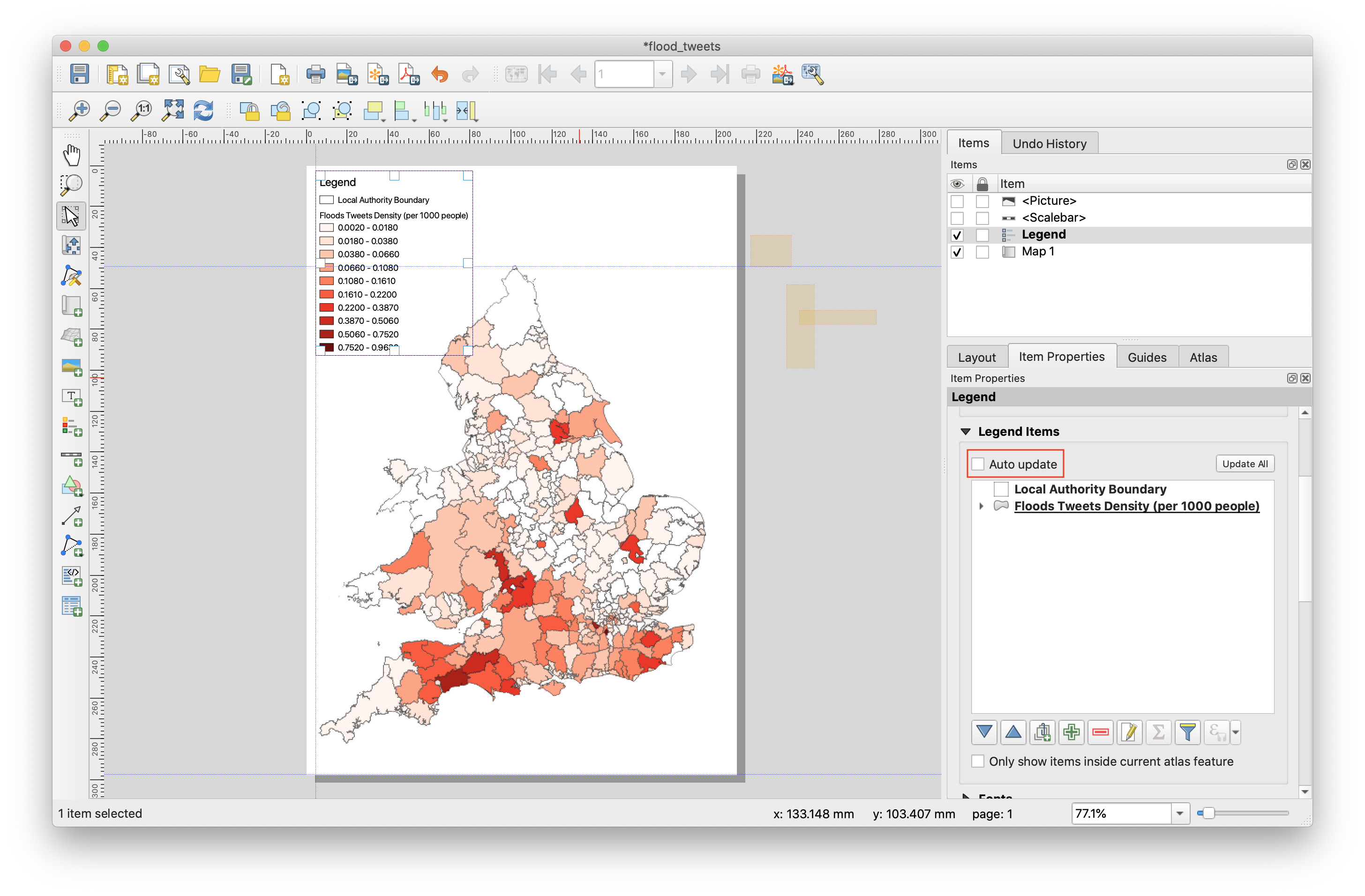
Not everything on the legend is necessary, so let’s remove some unwanted items.
- In the
Item Propertiestab, you’ll find theLegend itemspanel. UncheckAuto updateto enable editing function. - Select the
flood_tweets. - Delete it from the legend by clicking the minus button.
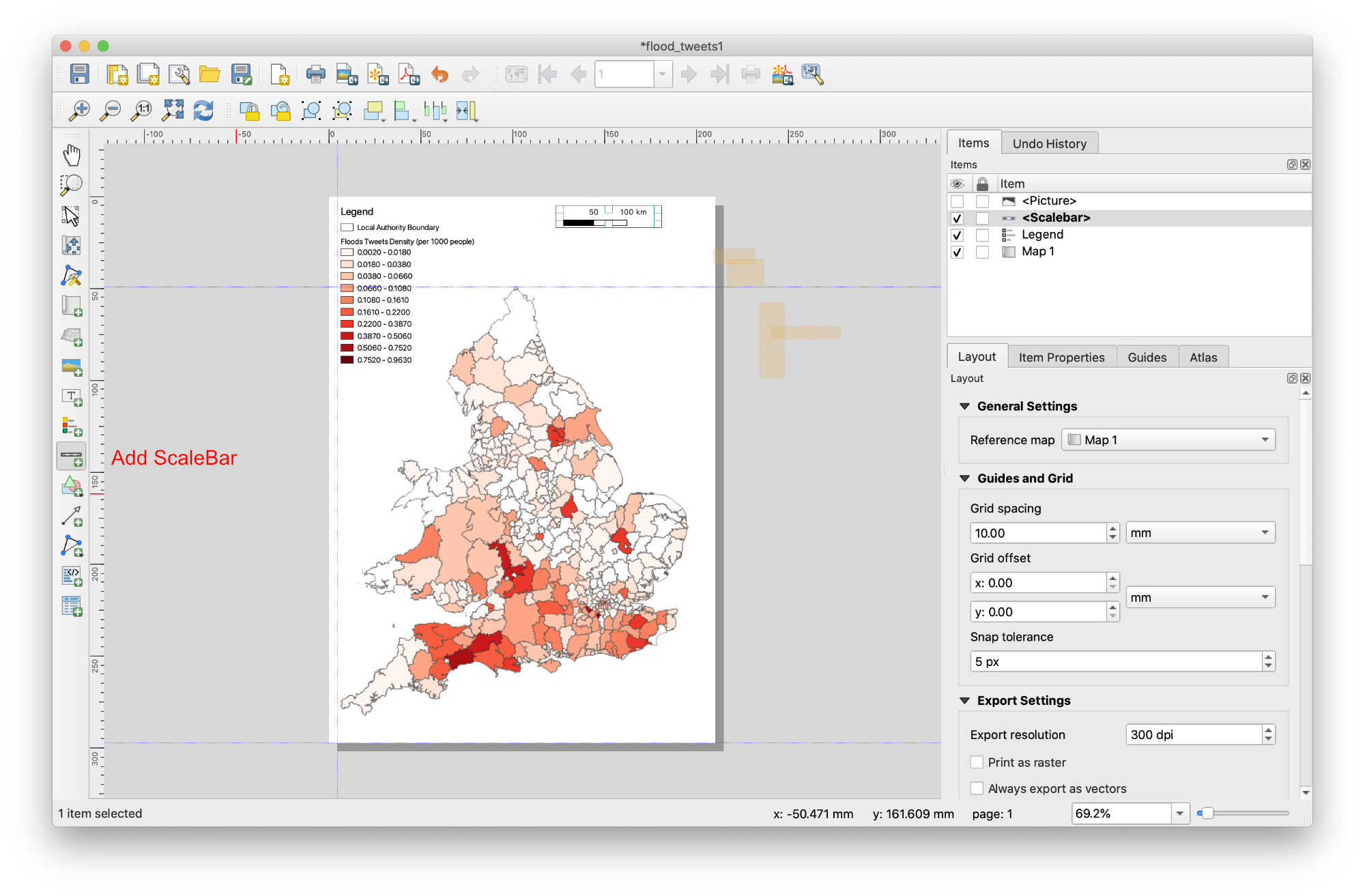
Add Scale
- Click on this button
Add Scale Bar - Click on the page, above the map, and a scalebar will appear at the top of the map.
- Resize it and place it in the top center of the page. It can be resized and moved in the same way that you resized and moved the map.
- As you move the title, you’ll notice that guidelines appear to help you position the title in the center of the page.
Add North Arrow
- Click on this button:
Add Picture - Click on the page to place the legend, and move it to where you want it.
- In the
Item Propertiestab, you’ll find theSearch Directoriespanel. Choose the north arrow you prefer.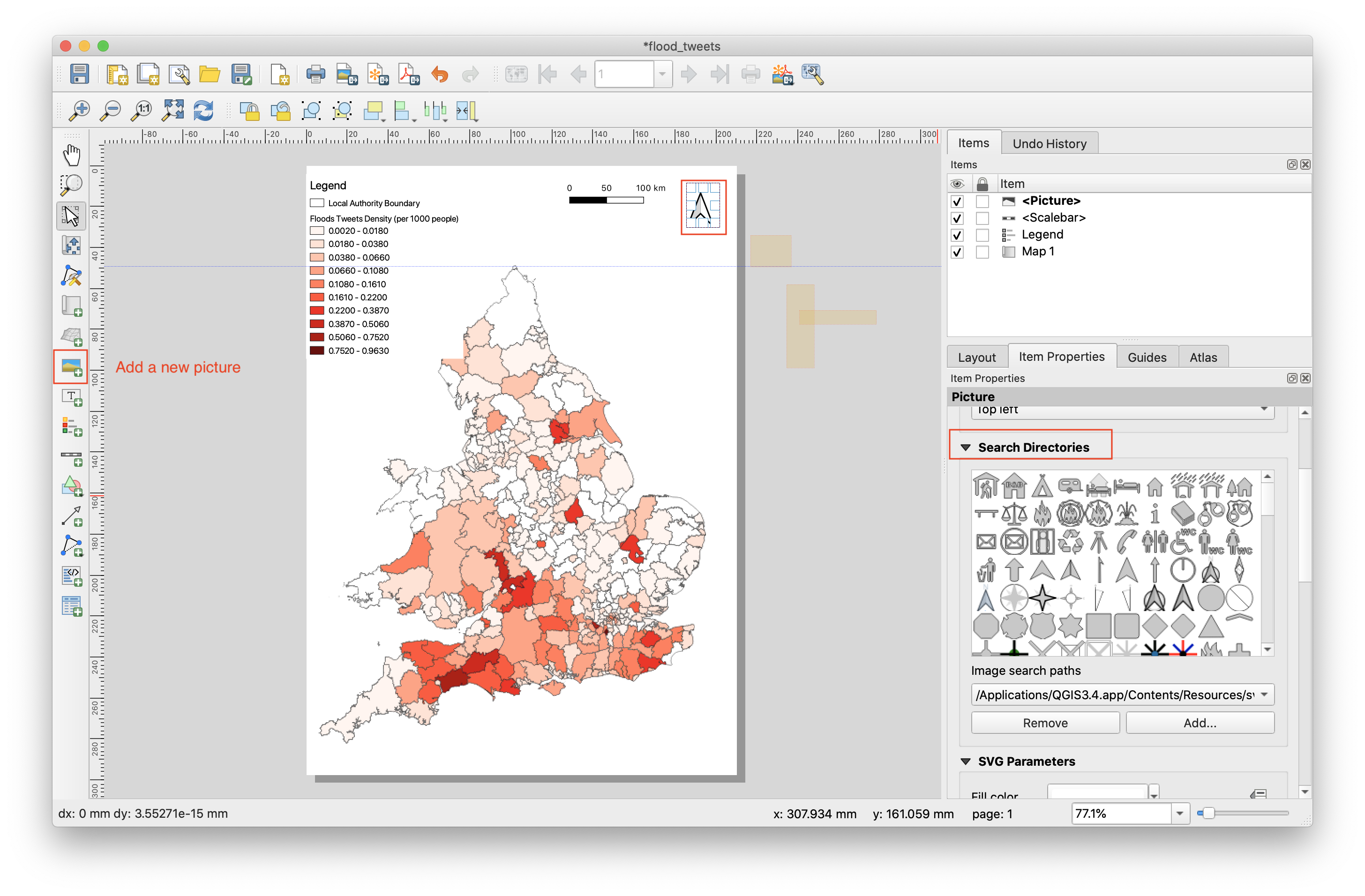
Adding elements is the basic step for a map. To make a good map, you need to do more! Check the experts’ guidence from ESRI illustrating how to make a meaning map by answeing 10 questions. 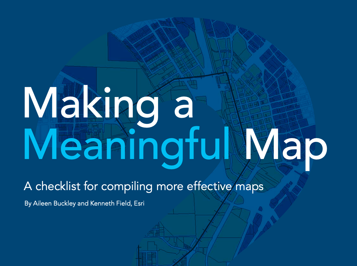 .
.
Exporting Your Map
Finally the map is ready for export!
- Find export buttons near the top left corner of the Layout window:
- Choose
Export as Image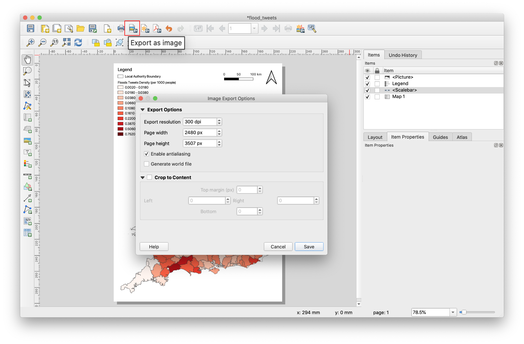
Final map: Density Map of Flood-related Tweets in UK